Skip to Content
News
View All
1
/
16
Beyond-Sports and MITdesignX to Launch Startup Accelerator for NFL Athletes
Retiring NFL Player Collin Johnson Collaborating with MITdesignX
MIT MAD affiliate MITdesignX is Hiring a Director of Activation and Communication
Addressing the impacts of invasive aquatic weeds in the Lake Volta region
Miso Chic, a PhD student at MIT brings an engineering mindset to the art of drag performance—and it’s paying off.
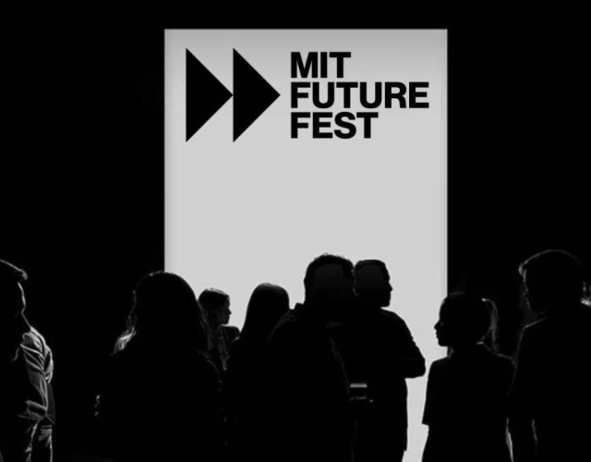
Announcing The Launch of MIT Future Fest: Where The Future is Made
MIT MAD is Hiring a Program and Research Administrator
Designing a career, on and off the track, at MIT
Senior Krystal Montgomery explored design courses to shape a career in web development. As a national champion in track, learning to balance athletics and academics was key to her success.
Connecting Gaia Exhibition
A new exhibition at the MIT Wiesner Student Art Gallery defies the distinctions between technology and biology, art and science, exploring and advancing our planet’s net of connections.
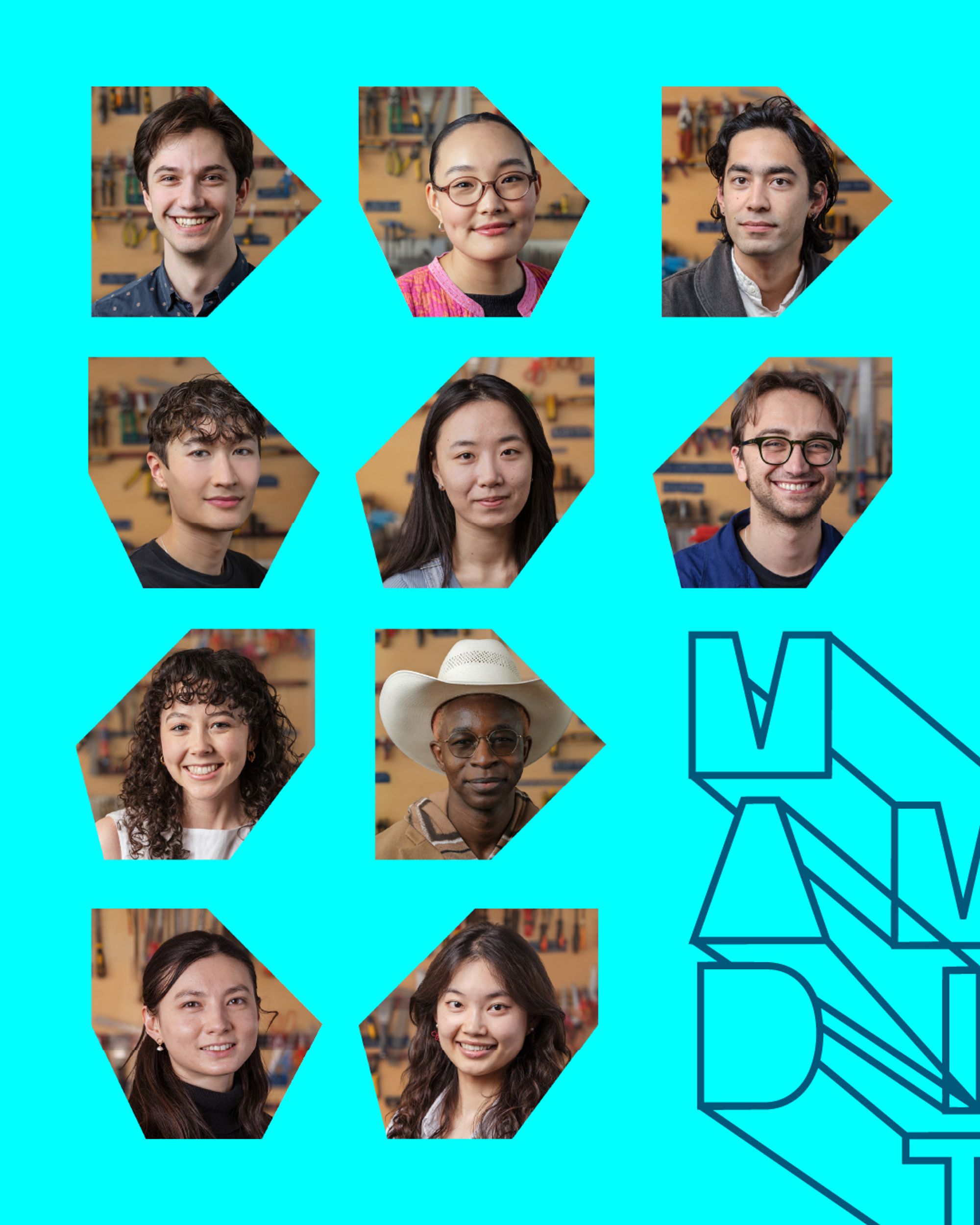
Introducing the 2026 MAD Design Fellows
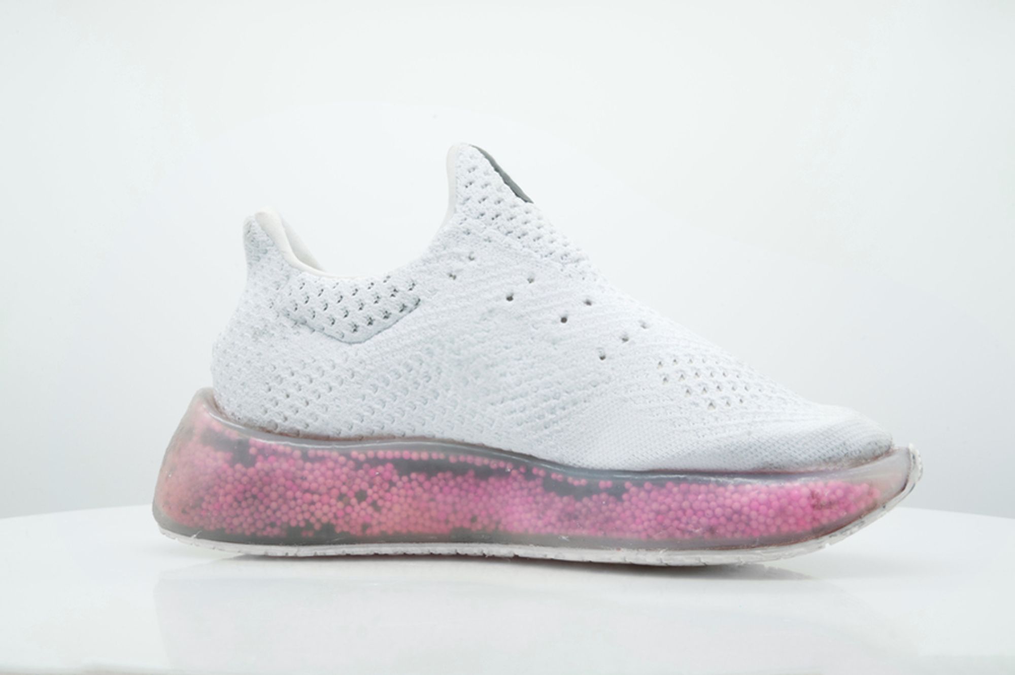
3 Questions: A running shoe that adapts to the runner
Associate Professor Skylar Tibbits discusses a new technology that uses granular convection to deliver individualized performance.
MIT MAD is Hiring a Communications Manager
John Ochsendorf named associate dean for research for the School of Architecture and Planning
The newly created role will shape the infrastructure needed to nurture the school’s growing research goals.
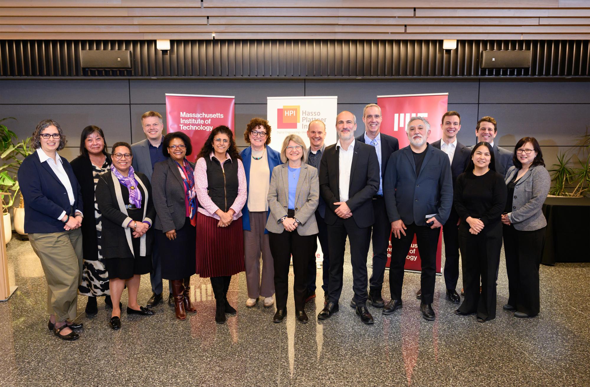
MIT and Hasso Plattner Institute establish collaborative hub for AI and creativity
Jointly led by the MIT Morningside Academy for Design, MIT Schwarzman College of Computing, and the Hasso Plattner Institute in Potsdam, the hub will foster a dynamic community where computing, creativity, and human-centered innovation meet.
New Class Uses Anthropology to Improve Chatbots
Rhea Vedro brings community wishes to life in Boston sculpture
The MIT lecturer and artist-in-residence transformed hundreds of inscribed and hammered steel plates into “Amulet,” a soaring public artwork at City Hall Plaza.
Events
View All
1
/
0
Projects
View All
1
/
17
VAMO—Vegetal, Animal, Mineral, Other
Automatic Example Generation for Babylonian Programming to facilitate Human-centric Domain Exploration
Aligning the useful and environmental lifetimes of plastics
The Design of Sustainable Academic Entrepreneurship Ecosystems for AI-Driven Venture Success
Strengthening orthothic and prosthetic care globally
Accessibility of online graphics for blind and low-vision users
Plug-and-Play: Increasing Autonomy in Apartment Living With Flexible Modular Design
Concrete Printed Bridge
AI-Enabled Design of Electroactive Surfaces for Sustainable Cell Culture
Human-AI interaction in generative design
2D Magnetic Material for Sustainable AI
AI-Powered Startup Design for the Anthropocene
AI-Empowered Architect: Connecting Creativity with Efficiency for Sustainable Structures Design
Collaborative Augmented Reality-Guided Mud Formwork for Optimized Structural Construction in Remote Areas
Using AI and Immersive Technologies to Experience the Future Self and Support Sustainable Dietary Choices
Predicting Functional Effects of Genetic Variants
Portable Kitchens
Learning
Undergraduates
Graduate Students
Faculty & Advising
Design Courses at MIT
Day of Design (K–12)
Making
MIT Maker Culture
Labs & Facilities
Research & Innovation
MIT and HPI AI and Creativity Hub (MHACH)
MIT–HPI Designing for Sustainability
Entrepreneurship
Community
Design Fellows
DesignPlus Advisors
Faculty Advisory Council
Student Advisory Council
Designers in Residence
MIT MAD/WPS Teacher Innovation Fellows
MIT Design Ecosystem
Team
Resources
Design Library
K-12 Educators
MAD Annual Reports
Applications
MIT Students
K–12 Educators
MIT Faculty
About
MIT MAD
Design Fellowship
DesignPlus Learning Community
Entrepreneurship—MITdesignX
MIT D-Lab
MAD Making
Contact
Room Reservation
Inclusivity &
Accessibility
Sign up for Mad News!
265 Massachusetts Ave
Bldg N52-373, Cambridge, MA 02139
High Contrast
Off
On
Pause Carousel
Announcing The Launch of MIT Future Fest: Where The Future is Made
What It’s Like Studying Design at MIT
Explore MIT MAD’s K-12 Educator Resources
A Running Shoe That Adapts to the Runner
Introducing the 2026 MAD Design Fellows
MIT and Hasso Plattner Institute establish collaborative hub for AI and creativity
New Class Uses Anthropology to Improve Chatbots
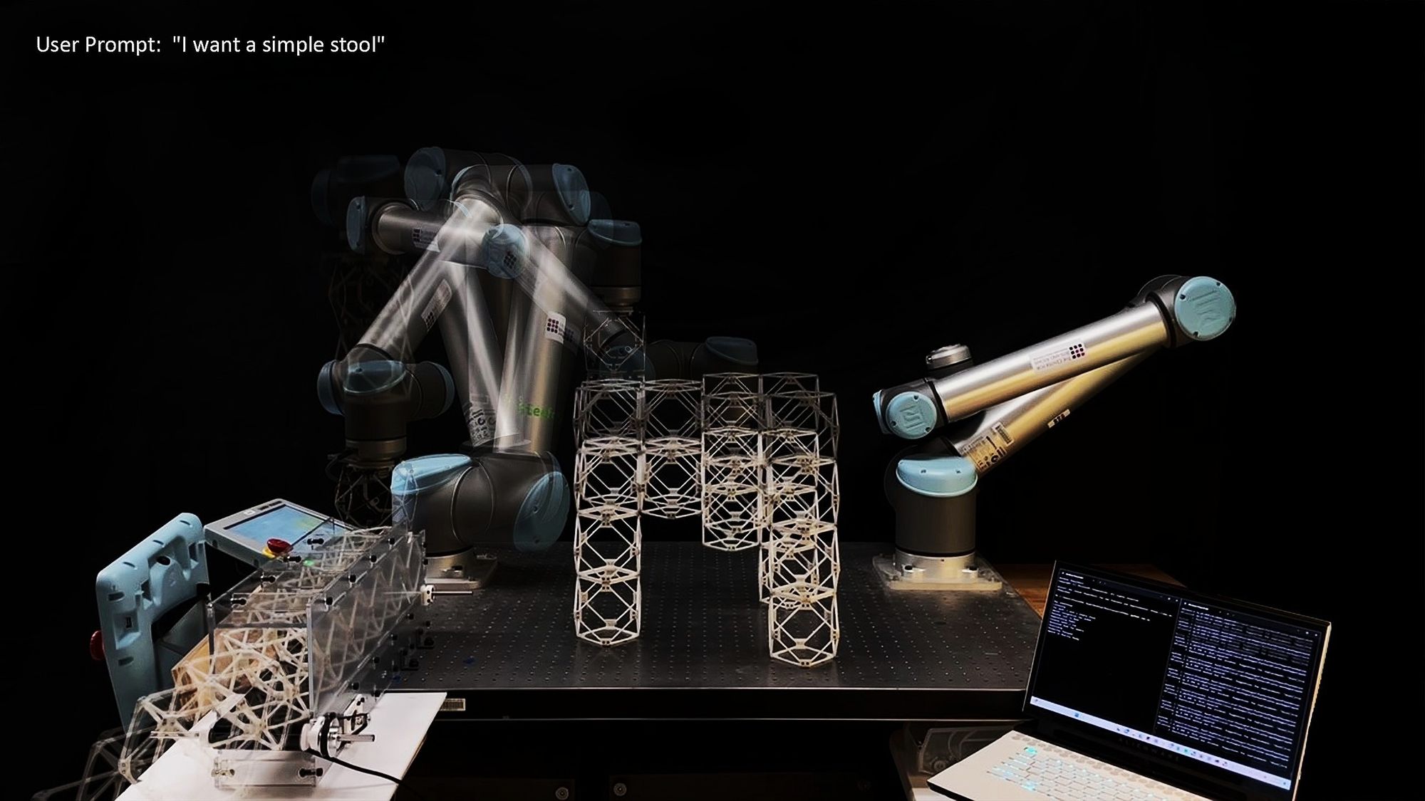
MIT Researchers ‘Speak Objects into Existence’ using AI and Robotics
Event Replay—Making What Matters: A Conversation with MAD Designer in Residence, Tony Fadell
1/9
Events
View All
Events
MIT Gala
Open Studio / Showcase,
Exhibition / Installation
May 10, 2026
MIT D-Lab Book (Chapters) Launch-n-Lunch
Book Launch / Author Talk
May 12, 2026
MITdesignX Demo + Pitch Day
MITdesignX,
Pitch Day / Entrepreneurship
May 21, 2026
Projects
View All
Projects